
Purely Cursor Set (V2)
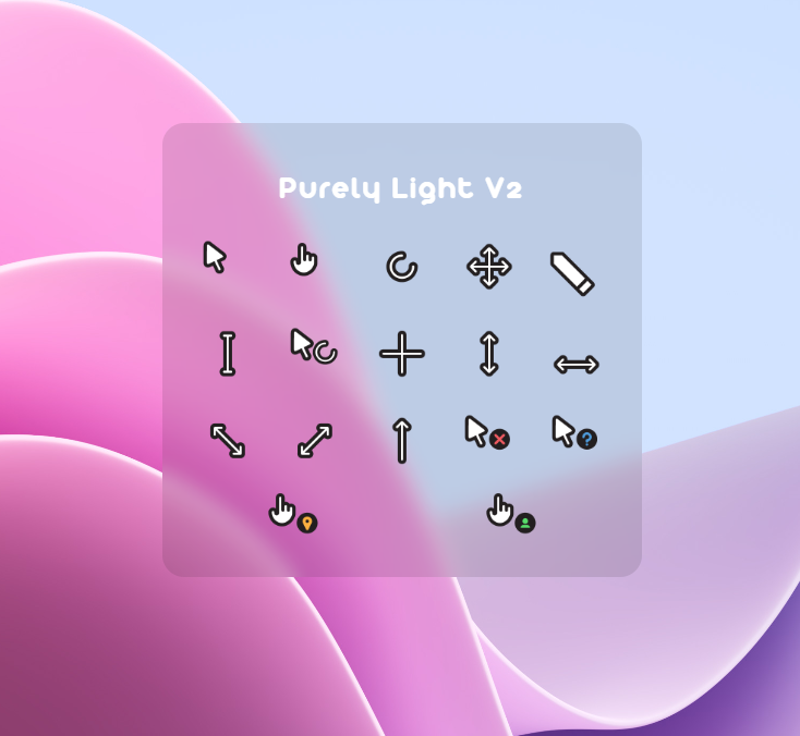
In my eyes, Purely V1 was very successful. A lot of my peers liked the simple, rounded design of the characters. So I recently decided to create a second, more unified version.
What changed?
To start with, all stroke and fill colors/thicknesses are 100% consistent this time. The process I used to create this new set ensured that the shapes were consistent before they were exported and processed. I also went through GREAT PAINS to make them on 64x64 artboards this time, to accommodate larger UI settings.
Loading Animation
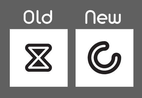
I did not like the Hourglass. It was one of the last icons I designed on V1, so it was a little rushed. This time, I spent more time thinking about its design, and how to make a loading animation FEEL like your computer is working on a task. This new icon and animation are snappy and more tailored to the design I've created.
Pencil
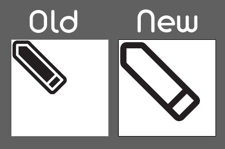
The same thing happened with the pencil icon; I could not get it right. But then I remembered the Apple Pencil! And I was suddenly inspired with a better design. It's also bigger, which you will never notice because the pencil icon is almost never used.
Highlighted... Tips?
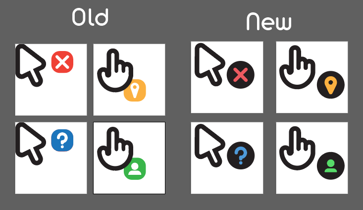
I'm not really sure what these variations are collectively called, but I redid them! I believe the spacing and choice of colors are easier to see and make more sense.
Download Purely V2 64xIn summary
This was a lot of fun to obsess over! And even still, I know there are details that could be improved. But I'm quite happy with this set (even happier than with Purely V1), and I hope lots of other people like it too! (And, yes I actually use it. I like it much better than the vanilla cursor on Windows!)
Download Purely Cursor SetHow to add custom cursors to Windows 11